This dashboard is an integrated Business Intelligence solution (Power BI) for the CRM DataCrazy, designed to centralize and monitor customer support operations. The main goal is to provide a 360º view of all communication channels, making it possible to manage queues, team productivity, and customer satisfaction in real time.
The dashboard works using dynamic filters that affect all visualizations at the same time.
Date Filter: Allows you to select specific periods (e.g.: "last 7 days", custom dates) for historical or recent analysis.
Multiple Selection: The manager can include or exclude departments from the analysis (e.g., remove Finance and HR to focus only on Sales).
Persistence: When you apply a department filter, it stays active as you browse different metrics (closed, open, etc.).
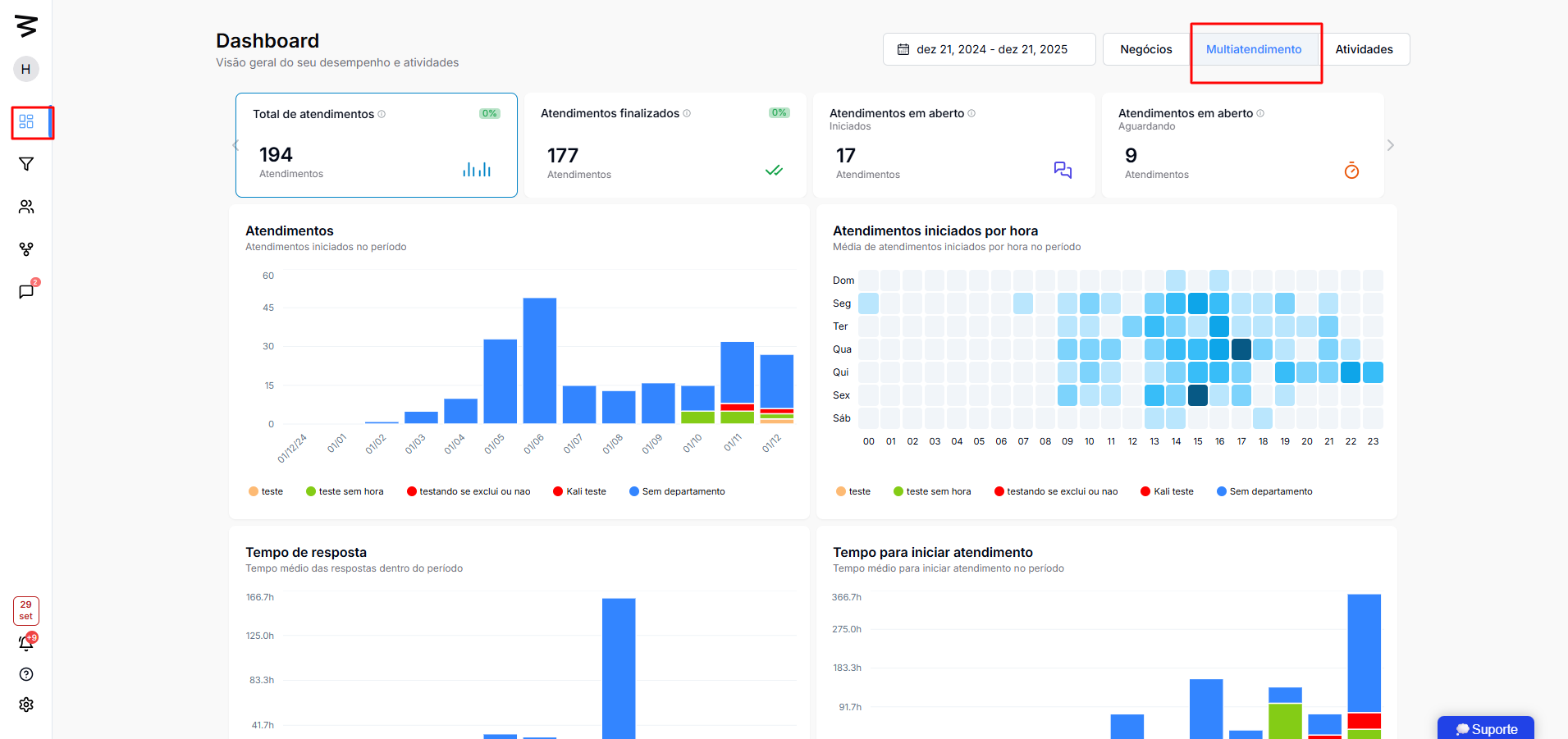
The top bar shows the consolidated totals for the selected period:
Total Interactions: Gross volume of interactions.
Previous Period Comparison: Trend indicator (increase or decrease in volume).
Closed: Total interactions successfully completed.
Open: Interactions started but not yet closed.
Waiting for Response: Critical. Interactions where the customer has sent a message and the agent hasn’t answered yet. Different from “not started.”
Volume per Day: Bar chart showing the number of daily cases.
Heatmap (Hour/Day): Identifies peak service times (e.g. "Monday at 10am"), essential for shift planning.
Average Response Time: How fast you get back to the customer during the conversation.
Average Time to Start: How long the customer waits in the queue until the first "hello".
Average Duration: Total time from the start to the end of the service.
By Department: Percentage distribution of the volume (e.g.: New Commercial: 22%, Old Commercial: 9%).
By Platform/Channel: Contact source (e.g.: 91 via WhatsApp, 7 via Instagram).
By Connection: Details by which number or specific account the contact came in.
The panel lets you click on any assistant (e.g.: "Eva dos Santos", "Ariane") to filter the whole dashboard just for that team member's data.
Available Individual Metrics:
Number of cases handled (Closed vs. Open).
Individual average times (Response, Start, Duration).
Productivity ranking (% of the total team).
This feature makes it possible to micromanage specific or tricky cases.
Details Table: Lists each service individually with ID, Status, Responsible assistant, and Client.
Time Tracking: Shows exactly:
Client entry time in the queue.
Wait time (e.g., 24 min).
Service start time.
End time.
Chat Access: Direct link to view the chat history inside the CRM DataCrazy.
Identify Bottlenecks: Filter by "Waiting for Response" to see which clients are being ignored and immediately check on the responsible assistants.
Performance Review: Compare the "Average Start Time" between new and old assistants.
Schedule Planning: Use the "Peaks per Hour" chart to put more staff during critical hours (e.g., Monday mornings).
Source Video:
